
Brand Identity Design Case Study
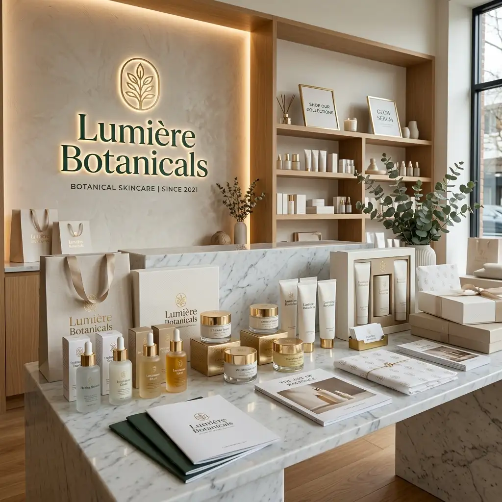
A refined brand identity system built around premium skincare, natural ingredients, and modern elegance. From logo and packaging to retail displays, digital assets, and brand guidelines, we created a cohesive visual system that delivers a memorable customer experience.
|
54+
Brand Assets Delivered
|
22+
Packaging Designs
|
100%
Brand Consistency
|
How We Got the Client
Lumière Botanicals approached us as a premium skincare brand with high-quality natural formulations and a clear vision for modern elegance, but without a refined brand identity to match. Their existing visuals felt inconsistent, the logo lacked distinction, and packaging, retail displays, and digital materials did not fully communicate the quality of the ingredients or the elevated experience the brand wanted to deliver. Competitors with polished identity systems were capturing the premium perception that Lumière Botanicals’ products deserved but its branding was not yet supporting.
We presented a full brand identity audit that mapped every customer touchpoint including packaging, retail displays, digital assets, and in-store materials. We showed exactly how a cohesive visual system would elevate perceived quality, strengthen recognition, and support the premium natural skincare positioning they wanted to own. That audit became the foundation of the engagement, and Lumière Botanicals signed on to build the complete brand identity.
What We Ensure in the Client Meeting
Before starting any brand identity project, we run a structured discovery session to align on positioning, audience, and visual direction. For Lumière Botanicals, this meeting covered:
- ✓ A deep dive into Lumière Botanicals’ product range, natural ingredient focus, target customer, and the premium skincare experience they wanted the brand to communicate
- ✓ Full audit of existing visual assets: current logo, packaging, labels, retail displays, social media graphics, and digital materials to identify inconsistencies and gaps
- ✓ Defining the brand personality, tone, and visual territory that would feel refined, natural, and modern while differentiating Lumière Botanicals in the premium skincare market
- ✓ Mapping every customer touchpoint that needed branded materials: packaging systems, labels, product mockups, retail displays, social templates, and brand guidelines
- ✓ Agreeing on brand guidelines standards, asset formats, approval process, and delivery timeline with the Lumière Botanicals team
- ✓ Setting clear deliverables: complete logo system, luxury packaging suite, color and typography system, product mockups, social media assets, and full brand guidelines
Brand identity work succeeds only when every visual element reinforces the same story. Getting complete alignment on positioning, personality, and the full list of required assets before design began ensured the final system would feel intentional and consistent across every touchpoint customers would encounter.
Project Overview
Lumière Botanicals is a premium skincare brand focused on natural ingredients, refined formulations, and a modern elegant experience. The brand had excellent product quality and a clear vision, but its visual presence was fragmented. Different logos, inconsistent packaging, and digital materials that did not fully communicate the natural premium positioning limited recognition and perceived value.
The goal of the project was to create a complete, cohesive brand identity system that reflected premium skincare, natural ingredients, and modern elegance. From logo and packaging through product mockups, social assets, and detailed brand guidelines, every element was designed to strengthen recognition, elevate the customer experience, and give the team a clear system to apply consistently across all future materials.
Before Performance: Where They Started
Here is a snapshot of Lumière Botanicals’ brand identity situation before we began working together.
|
Inconsistent
Visual Identity Across Touchpoints
|
Limited
Packaging System
|
None
Formal Brand Guidelines
|
At this stage, Lumière Botanicals had a functional but incomplete visual presence. The logo lacked a clear system of variations, packaging and labels did not share a unified language, digital assets felt disconnected, and there were no brand guidelines to keep future materials on-brand. The result was a brand that felt less refined than the quality of the skincare itself.
The Challenge
Before working together, Lumière Botanicals faced a set of challenges common to growing premium skincare brands that have strong product quality but underdeveloped visual identity:
- ✓ No cohesive logo system or clear brand mark that could work across packaging, retail displays, digital channels, and product collateral
- ✓ Inconsistent packaging and label designs that did not fully communicate the premium natural positioning or create a distinctive shelf presence
- ✓ Missing or mismatched color and typography systems that made the brand feel less refined and harder to recognize
- ✓ Limited product mockups, brand collateral, and social media assets that diluted the overall customer experience
- ✓ No brand guidelines document, leaving the team without a clear reference for applying the identity correctly on future materials
Our Strategy
We built a complete brand identity system for Lumière Botanicals that covered discovery, core visual elements, luxury packaging, product mockups, social assets, and a comprehensive set of brand guidelines. Every customer touchpoint reinforced the same refined, natural, and modern skincare experience.
- ✓ Brand Discovery & Logo Design
- ✓ Luxury Packaging & Label Design
- ✓ Color Palette & Typography System
- ✓ Product Mockups & Brand Collateral
- ✓ Social Media Brand Assets
- ✓ Complete Brand Guidelines
1. Brand Discovery & Logo Design
We developed a distinctive logo system rooted in Lumière Botanicals’ focus on natural ingredients and modern elegance. The primary mark, secondary lockups, and simplified versions were designed to work cleanly on packaging, retail displays, digital platforms, and product collateral while remaining instantly recognizable. Discovery work defined the personality, messaging pillars, and visual territory that would guide every subsequent design decision.
2. Luxury Packaging & Label Design
We designed a full suite of luxury packaging and labels for the skincare range. Each piece was crafted to communicate premium quality and natural ingredients at a glance, maintain consistency across formats, and create a distinctive, elevated presence on shelf and in retail environments.
3. Color Palette & Typography System
We created a refined color palette of soft neutrals, warm botanicals, and elegant accents that feel premium yet approachable for a natural skincare brand. A clear typography system pairing a distinctive display face with highly legible supporting fonts was established so that every piece of packaging, collateral, and digital content would share the same visual voice.
4. Product Mockups & Brand Collateral
We produced a complete set of product mockups and brand collateral that extended the new identity into realistic applications. These assets allowed the Lumière Botanicals team to present the full range with consistency and elevated perception across sales, retail, and digital channels.
5. Social Media Brand Assets
We produced a complete set of social media templates, profile assets, story formats, and post layouts that brought the new identity onto digital platforms. The system made it easy for the Lumière Botanicals team to create on-brand content quickly while maintaining the same refined visual quality customers experienced with the packaging and products.
6. Complete Brand Guidelines
We delivered a comprehensive brand guidelines document covering logo usage, clear space, color values, typography, packaging rules, photography direction, and do’s and don’ts. This became the single source of truth that ensures every future asset, whether created by the internal team or external partners, stays fully consistent with the identity we built.
The Results: Before vs After
Within the engagement period, Lumière Botanicals received a complete, production-ready brand identity system. Here is the direct before and after comparison.
| Metric | Before | After | Change |
|---|---|---|---|
| Brand Assets Delivered | Fragmented and incomplete | 54+ assets | 54+ brand assets delivered |
| Packaging Designs | Limited and inconsistent | 22+ designs | 22+ packaging designs |
| Brand Consistency | Inconsistent across touchpoints | 100% consistency | 100% brand consistency |
“We had beautiful products and strong natural ingredients, but our brand did not fully reflect the quality and elegance we wanted customers to feel. The new identity changed that completely. From the packaging and labels to our social content and retail presence, everything now feels refined, consistent, and premium. Having clear guidelines has also made it much easier for our team to stay on brand as we grow.” – Lumière Botanicals
Key Takeaway
Lumière Botanicals’ transformation came from turning strong product quality and a clear vision into a complete, usable brand identity system. Focused brand discovery and a distinctive logo gave the identity a solid foundation. A refined color and typography system created instant recognition. Luxury packaging and labels elevated perceived quality at the most important customer moments. Product mockups, collateral, and social assets extended the same experience across channels. Detailed brand guidelines ensured the system would stay consistent long after the project ended. For premium skincare and beauty brands, this is how you convert product quality into visual authority, and visual authority into stronger recognition, trust, and preference at every touchpoint.
Want results like this for your brand?
Let’s build a complete brand identity system that elevates your presence and creates consistency across every customer touchpoint.